Shanghai American School
Our design directive was to help cultivate pride among the SAS community. With so much of the school’s physical history lost during WWII and the Cultural Revolution, this project was an opportunity to excavate and elevate forgotten legends, while honoring the students and stories that will become the legends of tomorrow.


Project Summary
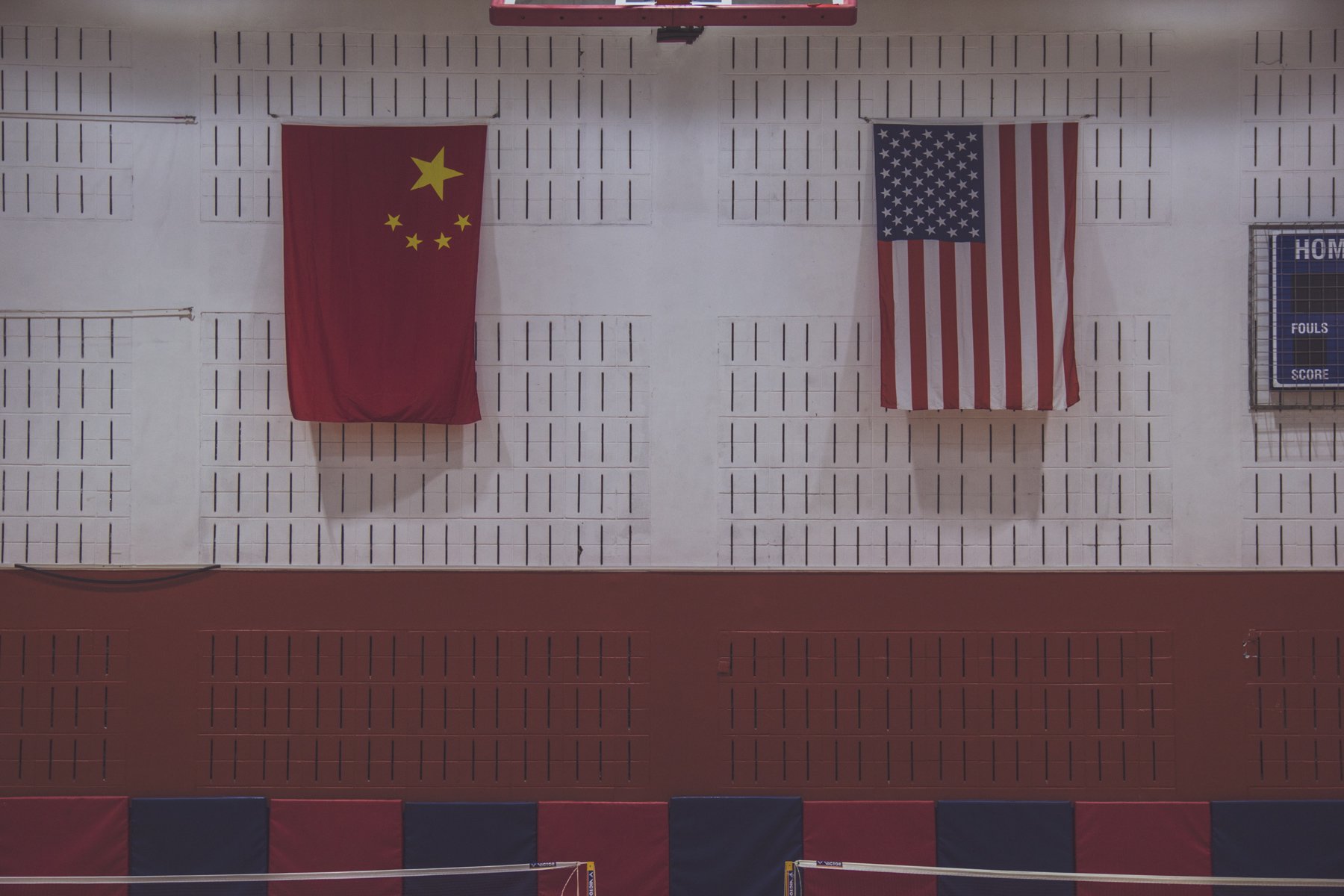
You don’t get to be the oldest and largest international school in China without a few stories along the way. Over the course of its 100+ year history, the Shanghai American School has withstood revolutions, moved campuses (including a brief stint holding classes in an internment camp shed), born and lost and rediscovered its legends and survived to become the academic and athletic powerhouse that it is today. How might a new visual identity capture such extraordinary history while charting a course for the future?
Our design directive was to help cultivate pride among the SAS community. With so much of the school’s physical history lost during WWII and the Cultural Revolution, this project was an opportunity to excavate and elevate forgotten legends, while honoring the students and stories that will become the legends of tomorrow.
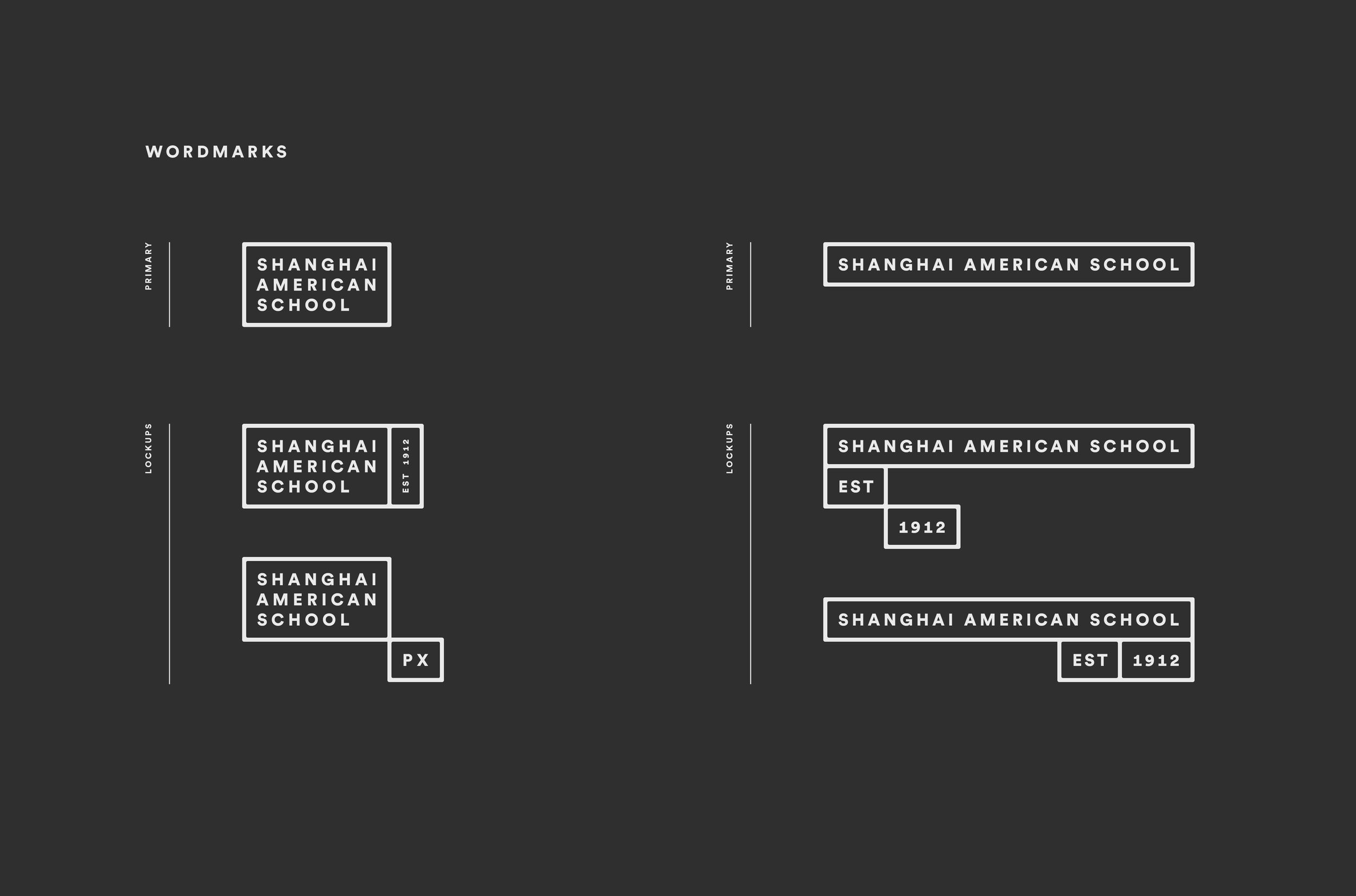
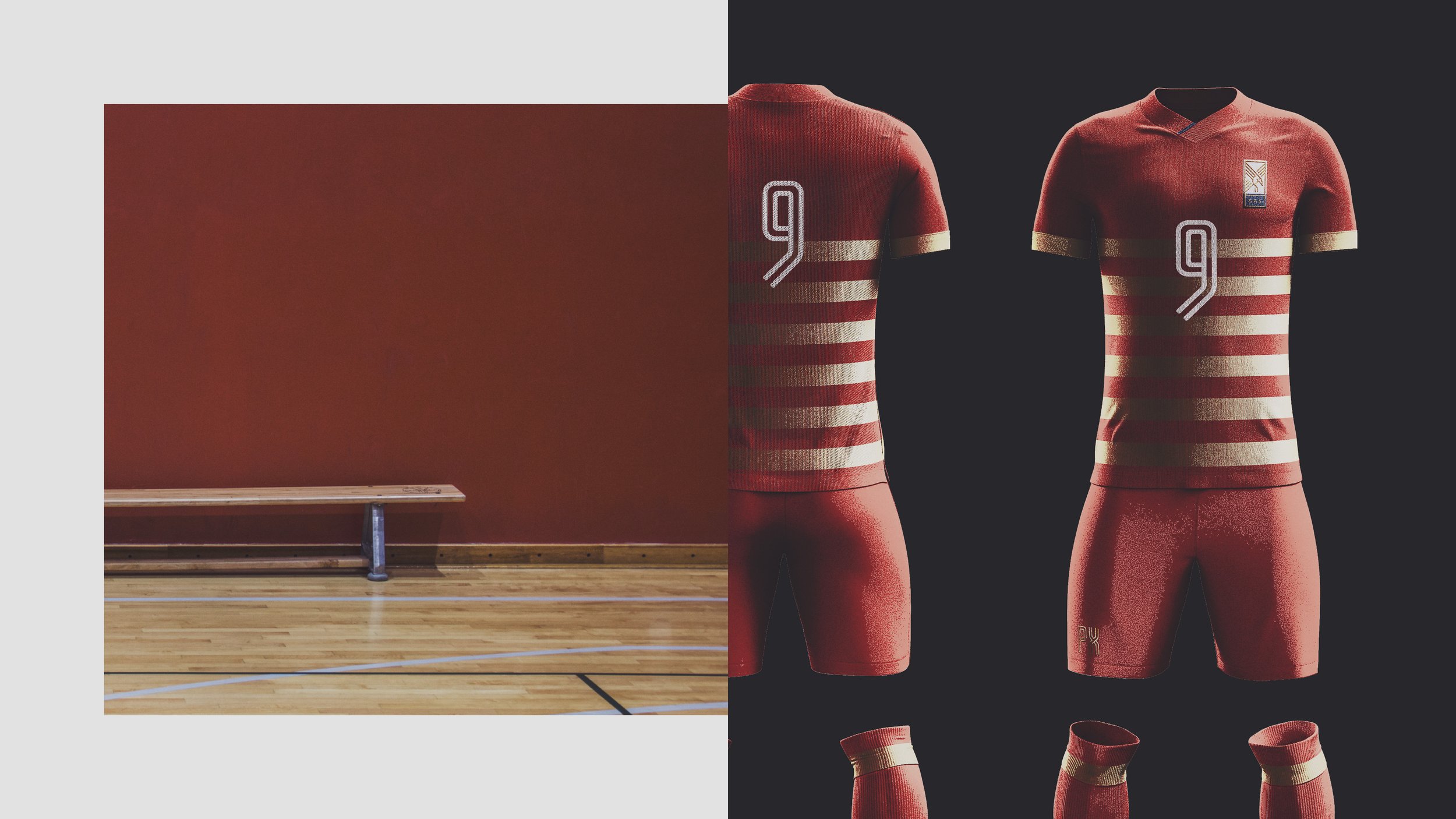
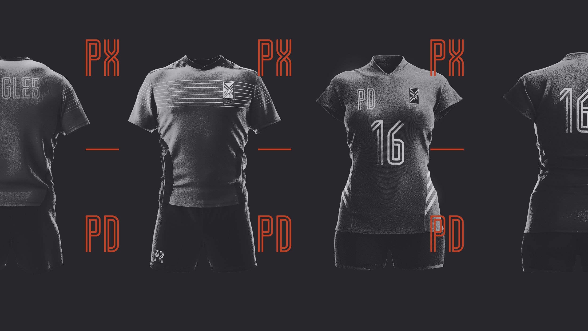
SAS is defined by its dualities — here, East meets West, strong athletics complement rigorous academics, history shapes future. The brand cannot be defined by any one dominant feature, but rather by its rich dichotomies. The new identity speaks to legacy, rigor, resilience and courage, giving the school a cohesive visual language that allows each division, department and team to distinguish itself while retaining a unified thread.